Most digital minimalism advice starts and ends with subtraction: delete the apps, turn off the notifications, move the home screen down to a handful of icons. That's a reasonable first step, and it genuinely helps. But it leaves out a second question that matters just as much: what happens with the apps you keep.
Deleting apps solves one problem, not all of them
A phone with three home screens of apps creates a specific kind of pull, the temptation to check, scroll, and reorganize things that don't need attention. Cutting that down removes a lot of noise, and for many people it's the single most effective change they make.
But an app doesn't have to be deleted to be a problem. Plenty of tools that survive the cull, a messaging app, a calendar, even a habit tracker, can still be built to ask more of you than they need to: badges to check, streaks to protect, a feed to scroll past before you get to the thing you opened it for. Digital minimalism that only counts app icons misses this second layer entirely.
The second question: what do the apps you kept actually ask of you
A useful test for any app still on your phone is what it wants from you beyond its core function. Does opening it to check one thing pull you past three other things first? Does it track something you didn't ask it to track, then remind you when the number looks bad? Does using it correctly require remembering to also not use it too much?
Apps built around attention as the business model tend to answer yes to most of these. Apps built around a single, narrow task tend to answer no. The difference isn't always obvious from the app icon or the store description. It shows up in how the app behaves once you're actually inside it.
What a minimalist phone setup actually looks like in practice
In practice, a genuinely minimal phone isn't defined by having fewer apps so much as having apps that ask less of you individually. A messaging app that just shows messages. A calendar that just shows the day. A tool that does the one thing you opened it for and then gets out of the way, rather than presenting a feed, a suggestion, or a "you might also like" on your way out.
This is a slightly different definition of minimalism than the one built entirely around subtraction. It's less about the number of icons on your home screen and more about whether each one respects the single reason you opened it.
Where a bell fits into this picture
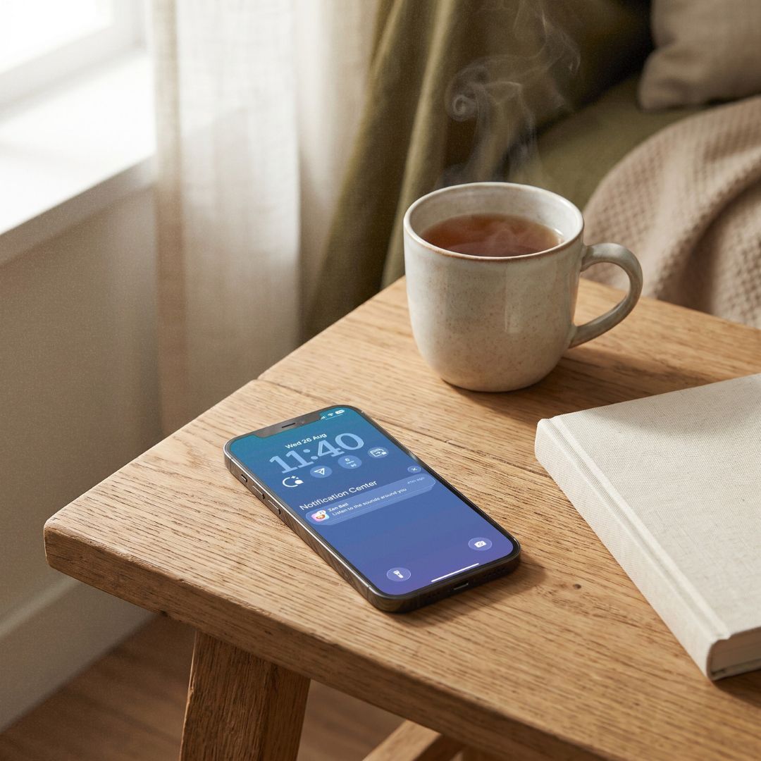
An interval bell is a small, specific case of this idea. Its entire job is to ring once and step back. There's no feed underneath it, no suggested content, no secondary ask once you've taken the breath it's there for. Judged by app-count minimalism, it's just one more icon. Judged by the second definition, what it asks of you once you're in it, it's closer to the kind of tool digital minimalism is usually reaching for in the first place.